

Sidebars are one of the most complex components to build. They are central to any application and often contain a lot of moving parts.
I don't like building sidebars. So I built 30+ of them. All kinds of
configurations. Then I extracted the core components into Sidebar*.vue.
We now have a solid foundation to build on top of. Composable. Themeable. Customizable.
Installation
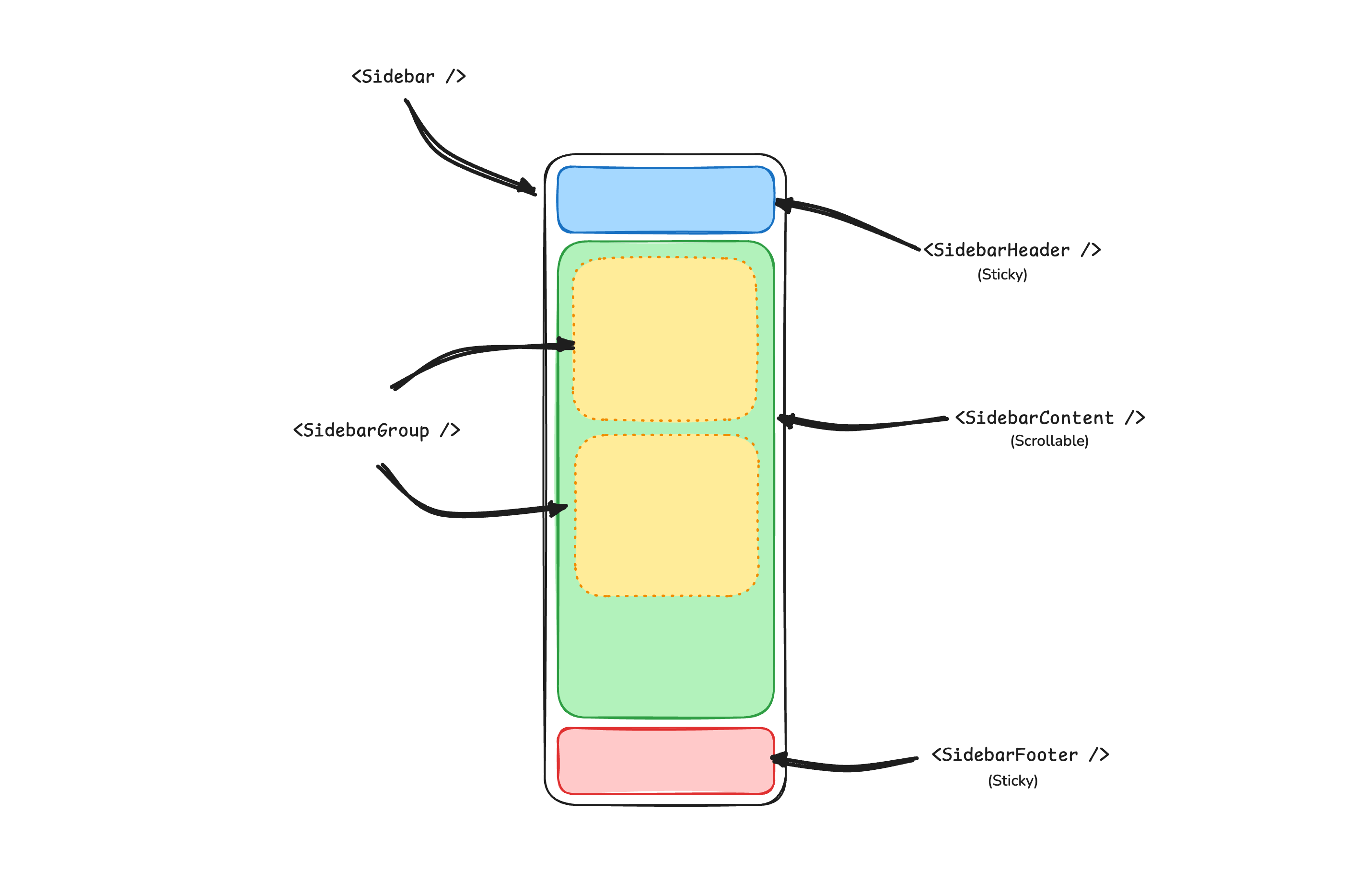
Structure
A Sidebar component is composed of the following parts:
SidebarProvider- Handles collapsible state.Sidebar- The sidebar container.SidebarHeaderand SidebarFooter - Sticky at the top and bottom of the sidebarSidebarContent- Scrollable content.SidebarGroup- Section within the SidebarContent.SidebarTrigger- Trigger for the Sidebar
Usage
<script setup lang="ts">
import {
Sidebar,
SidebarContent,
SidebarFooter,
SidebarGroup,
SidebarGroupContent,
SidebarGroupLabel,
SidebarHeader,
SidebarInset,
SidebarMenu,
SidebarMenuButton,
SidebarMenuItem,
SidebarProvider,
SidebarRail,
SidebarTrigger,
} from '@/components/ui/sidebar'
</script>
<template>
<SidebarProvider>
<Sidebar>
<SidebarHeader>
<SidebarMenu>
<SidebarMenuItem>
<SidebarMenuButton size="lg">
<div class="flex aspect-square size-8 items-center justify-center rounded-lg bg-sidebar-primary text-sidebar-primary-foreground">
<GalleryVerticalEnd class="size-4" />
</div>
<div class="grid flex-1 text-left text-sm leading-tight">
<span class="truncate font-semibold">Acme Inc</span>
<span class="truncate text-xs">Enterprise</span>
</div>
</SidebarMenuButton>
</SidebarMenuItem>
</SidebarMenu>
</SidebarHeader>
<SidebarContent>
<SidebarGroup>
<SidebarGroupLabel>Platform</SidebarGroupLabel>
<SidebarGroupContent>
<SidebarMenu>
<SidebarMenuItem>
<SidebarMenuButton as-child>
<a href="#">
<Home />
<span>Home</span>
</a>
</SidebarMenuButton>
</SidebarMenuItem>
</SidebarMenu>
</SidebarGroupContent>
</SidebarGroup>
</SidebarContent>
<SidebarFooter />
<SidebarRail />
</Sidebar>
<SidebarInset>
<header class="flex h-16 shrink-0 items-center gap-2 transition-[width,height] ease-linear group-has-[[data-collapsible=icon]]/sidebar-wrapper:h-12">
<div class="flex items-center gap-2 px-4">
<SidebarTrigger class="-ml-1" />
</div>
</header>
<div class="flex flex-1 flex-col gap-4 p-4 pt-0">
<div class="grid auto-rows-min gap-4 md:grid-cols-3">
<div class="aspect-video rounded-xl bg-muted/50" />
<div class="aspect-video rounded-xl bg-muted/50" />
<div class="aspect-video rounded-xl bg-muted/50" />
</div>
<div class="min-h-[100vh] flex-1 rounded-xl bg-muted/50 md:min-h-min" />
</div>
</SidebarInset>
</SidebarProvider>
</template>Your First Sidebar
Let's start with the most basic sidebar A collapsible sidebar with a menu.
Add a SidebarProvider and SidebarTrigger at the root of your application
<script setup lang="ts">
import AppSidebar from '@/components/AppSidebar.vue'
import { SidebarProvider, SidebarTrigger } from '@/components/ui/sidebar'
</script>
<template>
<SidebarProvider>
<AppSidebar />
<main>
<SidebarTrigger />
<slot />
</main>
</SidebarProvider>
</template>Create a new sidebar component at @/components/AppSidebar.vue
<script setup lang="ts">
import { Sidebar, SidebarContent } from '@/components/ui/sidebar'
</script>
<template>
<Sidebar>
<SidebarContent />
</Sidebar>
</template>Now, let's add a SidebarMenu to the sidebar
We'll use the SidebarMenu component in a SidebarGroup.
<script setup lang="ts">
import { Calendar, Home, Inbox, Search, Settings } from '@lucide/vue'
import {
Sidebar,
SidebarContent,
SidebarGroup,
SidebarGroupContent,
SidebarGroupLabel,
SidebarMenu,
SidebarMenuButton,
SidebarMenuItem,
} from '@/components/ui/sidebar'
// Menu items.
const items = [
{
title: 'Home',
url: '#',
icon: Home,
},
{
title: 'Inbox',
url: '#',
icon: Inbox,
},
{
title: 'Calendar',
url: '#',
icon: Calendar,
},
{
title: 'Search',
url: '#',
icon: Search,
},
{
title: 'Settings',
url: '#',
icon: Settings,
},
]
</script>
<template>
<Sidebar>
<SidebarContent>
<SidebarGroup>
<SidebarGroupLabel>Application</SidebarGroupLabel>
<SidebarGroupContent>
<SidebarMenu>
<SidebarMenuItem v-for="item in items" :key="item.title">
<SidebarMenuButton as-child>
<a :href="item.url">
<component :is="item.icon" />
<span>{{ item.title }}</span>
</a>
</SidebarMenuButton>
</SidebarMenuItem>
</SidebarMenu>
</SidebarGroupContent>
</SidebarGroup>
</SidebarContent>
</Sidebar>
</template>You've created your first sidebar.
You should see something like this:


Components
The components in the Sidebar*.vue files are built to be composable i.e you build your sidebar by putting the provided components together. They also compose well with other shadcn-vue components such as DropdownMenu, Collapsible, Dialog, etc.
If you need to change the code in the Sidebar*.vue files, you are encourage to do so. The code is yours. Use the provided components as a starting point to build your own
SidebarProvider
The SidebarProvider component is used to provide the sidebar context to all its children.
Props
The SidebarProvider component accepts the following props:
Width
Use the defaultOpen, open, and onOpenChange props to control the open state of the sidebar.
<script setup lang="ts">
import { ref } from 'vue'
const open = ref(false)
</script>
<template>
<SidebarProvider :open="open" @update:open="open = $event">
<!-- ... -->
</SidebarProvider>
</template>Keyboard Shortcut
The SidebarProvider component supports keyboard shortcuts to toggle the sidebar. The default shortcut is cmd+b or ctrl+b.
<SidebarProvider>
<!-- ... -->
</SidebarProvider>Persisted State
To persist the sidebar state, you can use the storageKey prop on the SidebarProvider component.
<SidebarProvider storage-key="sidebar">
<!-- ... -->
</SidebarProvider><SidebarProvider
:default-open="false"
storage-key="sidebar"
class="flex min-h-screen"
>
<!-- ... -->
</SidebarProvider>Sidebar
The main sidebar component.
<Sidebar>
<SidebarHeader />
<SidebarContent />
<SidebarFooter />
</Sidebar>Props
The Sidebar component accepts the following props:
side
Use the side prop to set the side of the sidebar.
<Sidebar side="left">
<!-- ... -->
</Sidebar>variant
Use the variant prop to set the variant of the sidebar.
<!-- Default variant -->
<Sidebar variant="sidebar">
<!-- ... -->
</Sidebar><!-- Floating variant -->
<Sidebar variant="floating">
<!-- ... -->
</Sidebar><!-- Inset variant -->
<Sidebar variant="inset">
<!-- ... -->
</Sidebar>collapsible
Use the collapsible prop to make the sidebar collapsible.
<Sidebar collapsible="icon">
<!-- ... -->
</Sidebar><Sidebar collapsible="offcanvas">
<!-- ... -->
</Sidebar>useSidebar
The useSidebar hook is used to control the sidebar.
<script setup lang="ts">
import { useSidebar } from '@/components/ui/sidebar'
const {
state,
open,
setOpen,
openMobile,
setOpenMobile,
isMobile,
toggleSidebar,
} = useSidebar()
</script>SidebarHeader
Used to render the sidebar header.
<Sidebar>
<SidebarHeader>
<SidebarMenu>
<SidebarMenuItem>
<SidebarMenuButton size="lg">
<div class="flex aspect-square size-8 items-center justify-center rounded-lg bg-sidebar-primary text-sidebar-primary-foreground">
<GalleryVerticalEnd class="size-4" />
</div>
<div class="flex flex-col gap-0.5 leading-none">
<span class="font-semibold">Documentation</span>
<span class="">v1.0.0</span>
</div>
</SidebarMenuButton>
</SidebarMenuItem>
</SidebarMenu>
</SidebarHeader>
</Sidebar>SidebarFooter
Used to render the sidebar footer.
<Sidebar>
<SidebarFooter>
<SidebarMenu>
<SidebarMenuItem>
<DropdownMenu>
<DropdownMenuTrigger as-child>
<SidebarMenuButton>
<User2 /> Username
<ChevronUp class="ml-auto" />
</SidebarMenuButton>
</DropdownMenuTrigger>
<DropdownMenuContent
side="top"
class="w-(--reka-popper-anchor-width)"
>
<DropdownMenuItem>
<span>Account</span>
</DropdownMenuItem>
<DropdownMenuItem>
<span>Billing</span>
</DropdownMenuItem>
<DropdownMenuItem>
<span>Sign out</span>
</DropdownMenuItem>
</DropdownMenuContent>
</DropdownMenu>
</SidebarMenuItem>
</SidebarMenu>
</SidebarFooter>
</Sidebar>SidebarContent
The scrollable content area of the sidebar.
<Sidebar>
<SidebarContent>
<SidebarGroup />
<SidebarGroup />
</SidebarContent>
</Sidebar>SidebarGroup
Used to group sidebar menu items.
<SidebarContent>
<SidebarGroup>
<SidebarGroupLabel>Application</SidebarGroupLabel>
<SidebarGroupContent>
<!-- SidebarMenu -->
</SidebarGroupContent>
</SidebarGroup>
</SidebarContent>Collapsible SidebarGroup
To make a SidebarGroup collapsible, wrap it in a Collapsible component.
<SidebarGroup as-child>
<Collapsible default-open class="group/collapsible">
<SidebarGroupLabel as-child>
<CollapsibleTrigger class="group/label w-full text-left text-sm text-sidebar-foreground hover:bg-sidebar-accent hover:text-sidebar-accent-foreground [&[data-state=open]>svg]:rotate-90">
Help
<ChevronRight class="ml-auto transition-transform group-data-[state=open]/collapsible:rotate-90" />
</CollapsibleTrigger>
</SidebarGroupLabel>
<CollapsibleContent>
<SidebarGroupContent>
<SidebarMenu>
<!-- Menu items -->
</SidebarMenu>
</SidebarGroupContent>
</CollapsibleContent>
</Collapsible>
</SidebarGroup>SidebarGroupAction
The SidebarGroupAction component is used to render an action button in the sidebar group header.
<SidebarGroup>
<SidebarGroupLabel>
Projects
<SidebarGroupAction>
<Plus /> <span class="sr-only">Add Project</span>
</SidebarGroupAction>
</SidebarGroupLabel>
<SidebarGroupContent></SidebarGroupContent>
</SidebarGroup>SidebarMenu
The SidebarMenu component is used to render a menu in the sidebar.
<SidebarGroupContent>
<SidebarMenu>
<SidebarMenuItem>
<SidebarMenuButton as-child>
<a href="#">
<Home />
<span>Home</span>
</a>
</SidebarMenuButton>
</SidebarMenuItem>
<SidebarMenuItem>
<SidebarMenuButton as-child>
<a href="#">
<Inbox />
<span>Inbox</span>
</a>
</SidebarMenuButton>
</SidebarMenuItem>
</SidebarMenu>
</SidebarGroupContent>SidebarMenuButton
The SidebarMenuButton component is used to render a menu button in the sidebar.
Link or Anchor
Use the as-child prop to render the SidebarMenuButton as a link or anchor.
<SidebarMenuButton as-child>
<a href="#">
<Home />
<span>Home</span>
</a>
</SidebarMenuButton>Icon and Label
You can render an icon and label in the SidebarMenuButton component.
<SidebarMenuButton>
<Home />
<span>Home</span>
</SidebarMenuButton>isActive
Use the isActive prop to mark a menu button as active.
<SidebarMenuButton :is-active="true">
<Home />
<span>Home</span>
</SidebarMenuButton>SidebarMenuAction
The SidebarMenuAction component is used to render a menu action in the sidebar.
<SidebarMenuItem>
<SidebarMenuButton>
<Home />
<span>Home</span>
</SidebarMenuButton>
<SidebarMenuAction>
<MoreHorizontal />
</SidebarMenuAction>
</SidebarMenuItem>DropdownMenu
You can use the SidebarMenuAction component with a DropdownMenu component.
<SidebarMenuItem>
<SidebarMenuButton>
<Home />
<span>Home</span>
</SidebarMenuButton>
<DropdownMenu>
<DropdownMenuTrigger as-child>
<SidebarMenuAction>
<MoreHorizontal />
</SidebarMenuAction>
</DropdownMenuTrigger>
<DropdownMenuContent side="right" align="start">
<DropdownMenuItem>
<span>Edit Project</span>
</DropdownMenuItem>
<DropdownMenuItem>
<span>Delete Project</span>
</DropdownMenuItem>
</DropdownMenuContent>
</DropdownMenu>
</SidebarMenuItem>SidebarMenuSub
The SidebarMenuSub component is used to render a submenu in the sidebar.
<SidebarMenuItem>
<SidebarMenuButton>
<Home />
<span>Home</span>
</SidebarMenuButton>
<SidebarMenuSub>
<SidebarMenuItem>
<SidebarMenuButton>
<span>History</span>
</SidebarMenuButton>
</SidebarMenuItem>
<SidebarMenuItem>
<SidebarMenuButton>
<span>Starred</span>
</SidebarMenuButton>
</SidebarMenuItem>
</SidebarMenuSub>
</SidebarMenuItem>Collapsible SidebarMenu
To make a SidebarMenu collapsible, wrap it in a Collapsible component.
<SidebarMenuItem>
<Collapsible default-open class="group/collapsible">
<CollapsibleTrigger as-child>
<SidebarMenuButton>
<Home />
<span>Home</span>
<ChevronRight class="ml-auto transition-transform group-data-[state=open]/collapsible:rotate-90" />
</SidebarMenuButton>
</CollapsibleTrigger>
<CollapsibleContent>
<SidebarMenuSub>
<SidebarMenuItem>
<SidebarMenuButton>
<span>History</span>
</SidebarMenuButton>
</SidebarMenuItem>
<SidebarMenuItem>
<SidebarMenuButton>
<span>Starred</span>
</SidebarMenuButton>
</SidebarMenuItem>
</SidebarMenuSub>
</CollapsibleContent>
</Collapsible>
</SidebarMenuItem>SidebarMenuBadge
The SidebarMenuBadge component is used to render a badge in the sidebar menu.
<SidebarMenuButton>
<Home />
<span>Home</span>
<SidebarMenuBadge>24</SidebarMenuBadge>
</SidebarMenuButton>SidebarMenuSkeleton
You can use the SidebarMenuSkeleton component to render a skeleton loader in the sidebar menu.
<SidebarMenu>
<SidebarMenuItem v-for="item in Array.from({ length: 5 })" :key="item">
<SidebarMenuSkeleton />
</SidebarMenuItem>
</SidebarMenu>SidebarSeparator
The SidebarSeparator component is used to render a separator in the sidebar.
<SidebarContent>
<SidebarGroup />
<SidebarSeparator />
<SidebarGroup />
</SidebarContent>SidebarTrigger
The SidebarTrigger component is used to render a trigger button for the sidebar.
<SidebarTrigger />Custom Trigger
You can create a custom trigger using the useSidebar hook.
<script setup lang="ts">
import { useSidebar } from '@/components/ui/sidebar'
const { toggleSidebar } = useSidebar()
</script>
<template>
<Button @click="toggleSidebar">
Toggle Sidebar
</Button>
</template>SidebarRail
The SidebarRail component is used to render a rail in the sidebar. This is usually used to toggle the sidebar on hover when the sidebar is collapsed.
<Sidebar collapsible="icon">
<SidebarHeader />
<SidebarContent />
<SidebarFooter />
<SidebarRail />
</Sidebar>Controlled Sidebar
Use the open and onOpenChange props to control the sidebar.
<script setup lang="ts">
import { ref } from 'vue'
const open = ref(false)
</script>
<template>
<SidebarProvider :open="open" @update:open="open = $event">
<Sidebar />
</SidebarProvider>
</template>Theming
You can theme the sidebar using CSS variables.
@layer base {
:root {
--sidebar-background: 0 0% 98%;
--sidebar-foreground: 240 5.3% 26.1%;
--sidebar-primary: 240 5.9% 10%;
--sidebar-primary-foreground: 0 0% 98%;
--sidebar-accent: 240 4.8% 95.9%;
--sidebar-accent-foreground: 240 5.9% 10%;
--sidebar-border: 220 13% 91%;
--sidebar-ring: 217.2 91.2% 59.8%;
}
.dark {
--sidebar-background: 240 5.9% 10%;
--sidebar-foreground: 240 4.8% 95.9%;
--sidebar-primary: 224.3 76.3% 48%;
--sidebar-primary-foreground: 0 0% 100%;
--sidebar-accent: 240 3.7% 15.9%;
--sidebar-accent-foreground: 240 4.8% 95.9%;
--sidebar-border: 240 3.7% 15.9%;
--sidebar-ring: 217.2 91.2% 59.8%;
}
}Styling
Here are some tips for styling the sidebar:
- Use the
data-sidebaranddata-stateattributes to style the sidebar. - The sidebar automatically sets the
--sidebar-widthCSS variable. You can use this to adjust the layout of your main content.